Facial Oil — The Golden Bottle Edit for a Considered Dropper Ritual and Personal Skincare Pairing
Facial Oil — The Golden Bottle Edit for a Considered Dropper Ritual and Personal Skincare Pairing
Couldn't load pickup availability

A different kind of flow ✨
A rounded droplet on glass. Light moving across a pale gold bottle. The small pause between opening a cap and deciding what comes next.
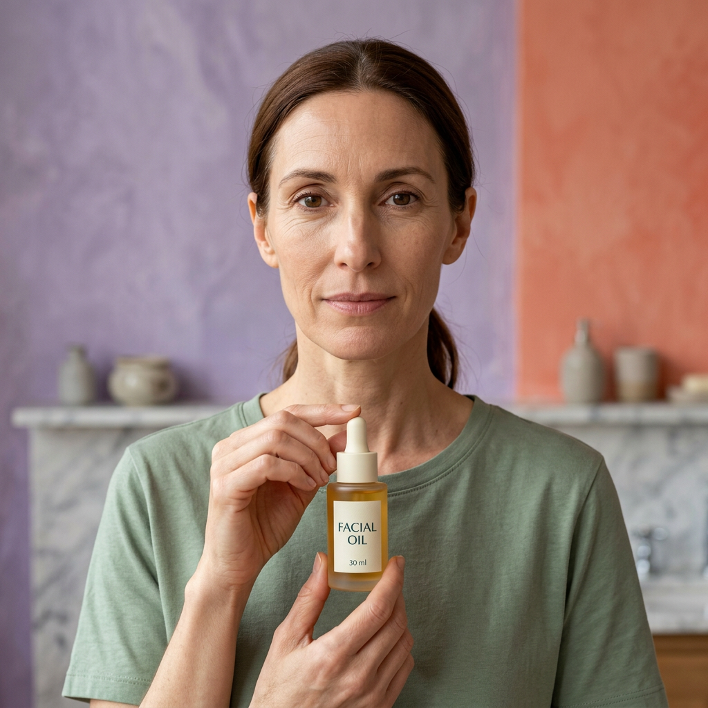
The Golden Bottle Edit explores facial oil through movement rather than a cream's sculpted shape. This proposed 30 ml concept brings a liquid-format direction to the collection, with a slender bottle, an ivory dropper closure, and a clear product name at the front.
It is an invitation to consider texture and routine deliberately. The formula is not yet confirmed, so the story begins with the design and the questions that matter before use, not an invented list of results.
Read the bottle before you read the mood
The proposed label reads FACIAL / OIL / 30 ml. Dark-teal lettering sits on ivory, echoing the closure and keeping the collection visually connected. A frosted honey-gold body distinguishes the oil from the cooler-colored bottles and jars.
The gold belongs to the packaging palette. It does not identify a botanical source, establish an ingredient, or guarantee the finished liquid's color. The final production package and approved formula should be compared with this creative direction before publication.
There is no brand logo, percentage claim, or certification badge in the proposed front-label design.
Two textures, two different questions 🫧
A cream photograph invites you to notice a fold or a peak. An oil photograph invites you to notice a surface: the edge of a droplet, the curve of a thin pool, the way reflected light changes as it spreads.
Those are visual differences, not proof that one format is better. If you are considering a facial oil, ask whether you enjoy that type of application and what role the confirmed product is intended to play.
The liquid imagery here is a creative visualization. It cannot establish viscosity, fragrance, spread, residue, absorption speed, or the finish on skin. Terms such as dry oil, fast-absorbing, non-greasy, or weightless require support from the finished product and are not promises made by this draft.
The dropper sequence: prepare, dispense, close
Prepare a stable place
Place the bottle upright on a clean, stable surface before opening it. A narrow bottle needs a dependable place to stand, especially when your hands or counter are wet.
Check the approved directions for whether skin and hands should be dry or damp. Do not use a styled photograph as an application instruction.
Dispense according to the final label
The dropper is the proposed dispensing format. Follow the finished product's instructions for the amount to use and how to apply it. The number or size of droplets in the campaign is not a dosage recommendation.
Keep the pipette from touching skin or other surfaces when dispensing. Do not introduce water or another product into the bottle. If the approved package uses a different dispensing method, its instructions take precedence.
Close before moving on
Return the closure and secure it after use. Follow the final storage instructions, including any guidance about light or temperature. The sunny campaign setting is an aesthetic choice, not a recommendation to store the bottle in direct sunlight.
Pair by directions, not by trend 🧭
Where an oil belongs in a routine depends on the product and the other formulas involved. The name alone cannot establish whether it should go before or after your moisturizer, whether it belongs in a morning or evening routine, or whether it suits the treatments you use.
Read the finished label alongside the instructions for your existing products. Introduce changes thoughtfully rather than assuming every additional layer will be useful.
Do not mix the oil into sunscreen, foundation, or another skincare product unless the relevant directions explicitly support it. Compatibility with makeup and other formulas must be assessed using the actual product.
This concept is not a sunscreen. A reflective or glossy appearance does not indicate sun protection.
Choose the setting that feels like yours
The studio image gives the bottle a cobalt platform and a coral backdrop. The vanity direction brings it into a smaller, more ordinary space with a towel and a mirror. The close-up study focuses on the visual language of a liquid.
You do not need the campaign's counter or its light. A practical routine may take place before work, after a shower, or when you finally have a quiet minute. The appropriate timing and frequency must still follow the confirmed directions.
The adult-model images introduce scale and presentation. They are not testimonials, demonstrations of results, or evidence of suitability for a particular skin type.
A note about the proposed ingredients
Squalane and jojoba were considered as an initial formulation direction. Neither is a confirmed ingredient in this draft. A final supplier ingredient list is needed before either can be advertised as present, and any sourcing or concentration statement needs its own supporting information.
Plant-derived, vegan, fragrance-free, non-comedogenic, sensitive-skin suitability, and clinical testing have not been established. Nor does this concept promise barrier repair, treatment of skin conditions, or a particular duration of moisturization.
The bottle at a glance
- Proposed category: facial oil.
- Proposed size: 30 ml.
- Design direction: frosted honey-gold bottle, ivory dropper closure, dark-teal typography.
- Texture story: liquid droplets and flow, illustrated conceptually.
- Price: $40.00.
- To confirm: complete formula, package materials, net volume, directions, precautions, and supported benefits.
Leave space for your own preference
Perhaps you prefer a cream's familiar consistency. Perhaps a liquid-format ritual interests you. The useful choice is not the most fashionable one; it is the one supported by clear information and suited to the routine you actually want to follow.
The Golden Bottle Edit offers a design starting point: warm color, readable labeling, and a deliberate dispensing story. Let verified product details complete that picture before deciding whether it belongs on your shelf.
Concept-stage draft. All gallery images are AI-generated visualizations rather than photographs of an approved production sample. Formula, ingredients, appearance, packaging, net volume, use instructions, precautions, and product claims must be confirmed before publication. Towels, trays, glass surfaces, and other styling props are not confirmed package contents.